
Table of Contents
- Quick Answer
- Breaking Down the Hellstar Logo
- The Meaning of ‘Hell’ + ‘Star’
- Why the Logo Feels Spiritual (But Isn’t Religious)
- How the Logo Supports Hellstar’s Brand Identity
- Hellstar Logo vs Typical Streetwear Logos
- Who Connects Most With the Hellstar Logo
- FAQ
- Conclusion
- Internal Reference
Quick Answer
The Hellstar logo represents contrast—light within darkness.
It combines the idea of “hell” (struggle, chaos) with “star” (guidance, hope). The meaning is intentionally open so people can project their own story onto it.
Breaking Down the Hellstar Logo
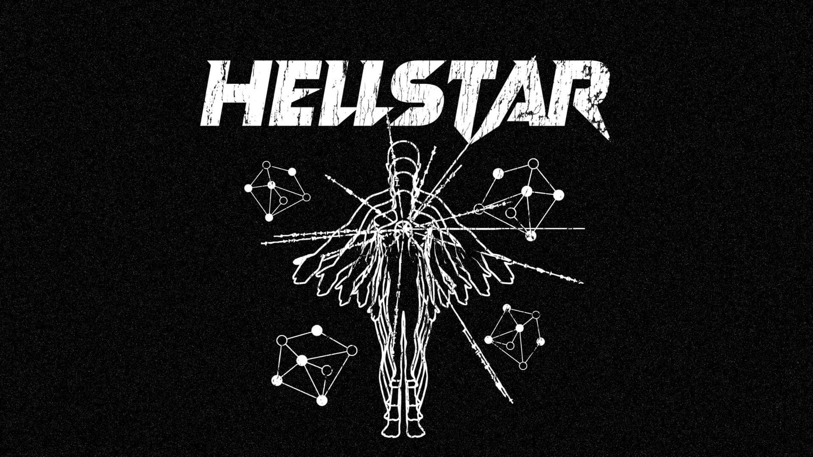
Visually, the logo and related marks often include:
- Star-like forms
- Gothic or sharp typography
- High-contrast light vs dark elements

These choices are deliberate. In brand design, sharp contrast signals tension, which aligns with Hellstar’s emotional themes.
The Meaning of ‘Hell’ + ‘Star’
From a naming perspective:
- Hell → struggle, pain, chaos
- Star → direction, hope, aspiration
Put together, Hellstar implies:
finding guidance inside difficult circumstances.
This duality is why the logo feels deeper than a standard wordmark.
Why the Logo Feels Spiritual (But Isn’t Religious)
Hellstar borrows the visual language of spirituality:
- Light imagery
- Celestial references
- Angelic or cosmic motifs
But it does not promote doctrine.
Streetwear commentary often frames brands like Hellstar as using spiritual aesthetics for emotional impact, not religious messaging.
How the Logo Supports Hellstar’s Brand Identity
A strong logo should:
- Reflect the brand’s emotional tone
- Be recognizable from a distance
- Work across different garments
Hellstar’s logo does all three.
It reinforces the brand’s themes without needing a long explanation.
Hellstar Logo vs Typical Streetwear Logos
| Element | Typical Streetwear Logo | Hellstar Logo |
|---|---|---|
| Purpose | Brand recognition | Emotional symbolism |
| Visual Style | Clean, minimal | Dark, expressive |
| Message | “This is the brand” | “This is the feeling” |
| Interpretation | Fixed | Open-ended |
This difference is why people describe Hellstar’s logo as more “meaningful” than a standard logo.
Who Connects Most With the Hellstar Logo
The logo resonates most with people who:
- Like symbolic graphics
- See clothing as emotional expression
- Prefer darker or spiritual aesthetics
- Want more than just a logo
If you want simple branding, Hellstar’s logo may feel too heavy.
If you want symbolism, it clicks instantly.
FAQ
Is the Hellstar logo religious?
No. It uses spiritual imagery, not religious doctrine.
Does the logo have an official meaning?
The brand does not publish one fixed meaning. Open interpretation seems intentional.
Why do people feel connected to the logo?
Because it reflects inner conflict and hope—two very common human experiences.
Conclusion
So—what does the Hellstar logo mean?
It symbolizes finding light in dark places.
That open meaning is exactly why it resonates. It does not tell you what to feel—it reflects what many people already feel.
Internal Reference
If you are building a streetwear brand and want to create logos that carry emotional weight—not just recognition—understanding symbolic design matters.
Explore how concept-driven branding is developed at 👉 Fuki Apparel
Because the best logos do not just identify brands—they express ideas.