
People often notice Hellstar hoodies before they understand them:
“They feel dark, heavy, and symbolic… but what exactly makes a Hellstar hoodie look like a Hellstar hoodie?”
I’ve worked with streetwear design and production, and Hellstar stands out because its design language is intentional, repeatable, and symbolic—not decorative.
Below is a clear breakdown of the core design elements that define Hellstar hoodies.
Table of Contents
- Quick Answer
- Overall Design Philosophy
- Signature Graphic Language
- Color and Wash Treatments
- Typography and Text Placement
- Silhouette and Fit Structure
- Fabric Weight and Construction Details
- Design Element Comparison Table
- Why These Elements Matter to Buyers
- FAQ
- Conclusion
- Internal Reference
Quick Answer
Hellstar hoodies are defined by dark symbolism, oversized silhouettes, heavyweight fabrics, washed colorways, and bold graphic placement.
Every design choice supports one goal:
emotional impact before explanation.
Overall Design Philosophy
Hellstar is not trend-led.
It is symbol-led.
From a design standpoint, Hellstar focuses on:
- Contrast (light vs dark)
- Emotional tension
- Spiritual and cosmic imagery
- Raw, unfinished energy
This approach puts Hellstar closer to conceptual streetwear than seasonal fashion.
Publications like Hypebeast and Highsnobiety often describe Hellstar as a brand where meaning comes before aesthetics.
Signature Graphic Language
Graphics are the most recognizable design element.
Common motifs include:
- Stars, flames, angels
- Heaven-and-hell symbolism
- Cosmic or apocalyptic visuals
- Hand-drawn or distressed artwork
Design traits:
- Large-scale prints
- High contrast
- Central chest or full-back placement
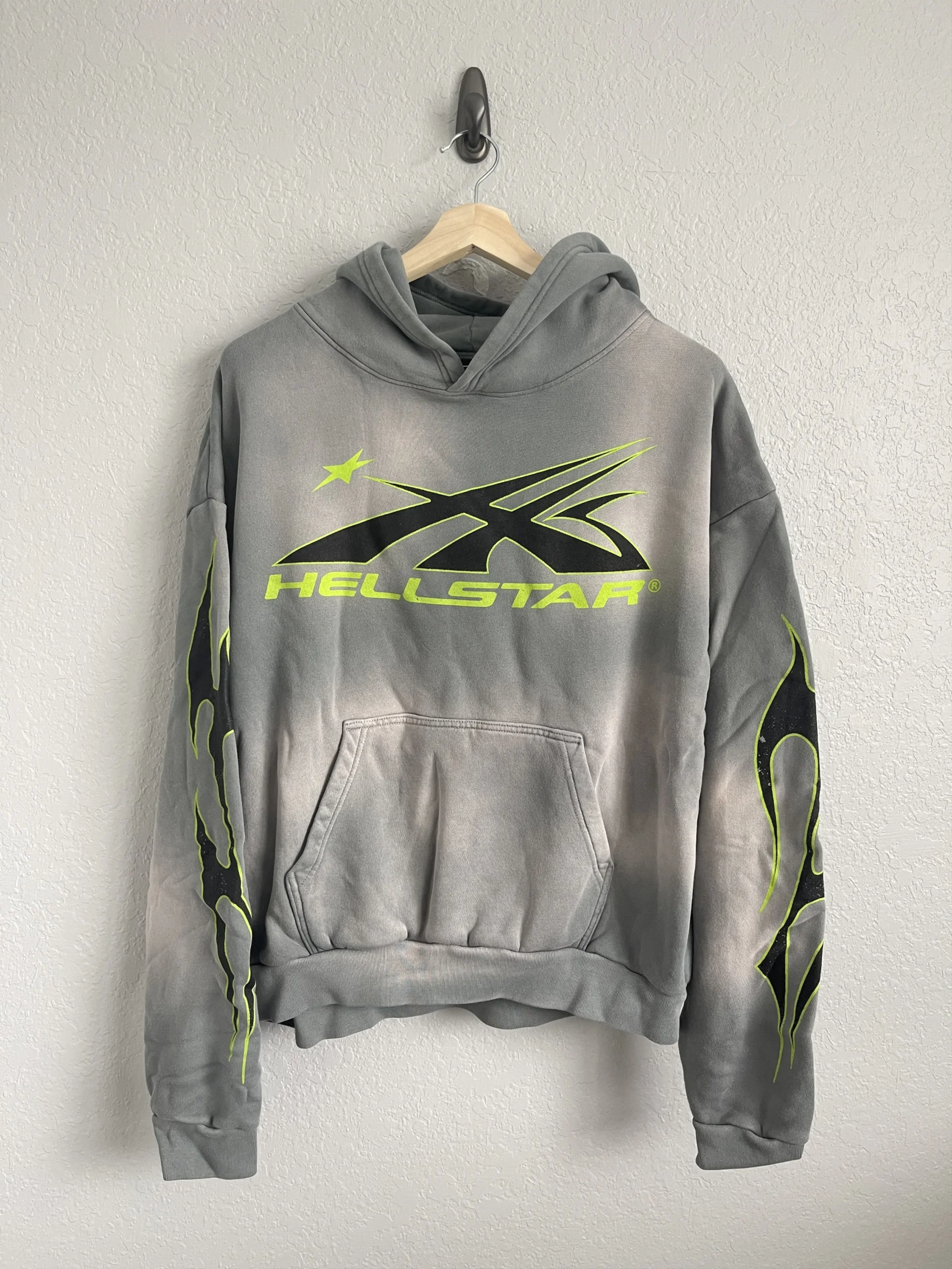
Hellstar graphics are meant to feel confrontational, not decorative.
Color and Wash Treatments
Hellstar relies heavily on washed and muted tones.
Popular treatments include:
- Washed black
- Charcoal
- Faded grey
- Earthy browns
These finishes:
- Add texture
- Create a worn-in feel
- Reinforce emotional depth
Bright colors are rare—and usually secondary to the graphic.
Typography and Text Placement
Text is used sparingly but deliberately.
Typical characteristics:
- Gothic or distressed fonts
- Religious or existential phrases
- Asymmetrical placement
- Integration with graphics
Typography is never clean or corporate.
It’s meant to feel raw and imperfect.
Silhouette and Fit Structure
Hellstar hoodies use a boxy, oversized silhouette.
Key fit traits:
- Dropped shoulders
- Wide body
- Structured cuffs and hem
- Shorter length than traditional oversized hoodies
This creates a strong visual shape, even when layered.
Fit is part of the design—not an afterthought.
Fabric Weight and Construction Details
From a production perspective, Hellstar hoodies usually feature:
- Heavyweight cotton or fleece
- Thick ribbing
- Dense stitching
- Durable print applications

The physical weight supports the emotional weight of the design.
This is one reason Hellstar hoodies feel “serious” when worn.
Design Element Comparison Table
| Element | Typical Streetwear | Hellstar |
|---|---|---|
| Graphics | Trend-based | Symbol-driven |
| Color | Seasonal | Dark & washed |
| Fit | Relaxed | Boxy & structured |
| Fabric | Mid-weight | Heavyweight |
| Mood | Stylish | Emotional |
This consistency is why Hellstar is instantly recognizable.
Why These Elements Matter to Buyers
Buyers aren’t just responding to visuals.
They’re responding to:
- Identity signaling
- Emotional resonance
- Scarcity + consistency
- A recognizable design language
Hellstar hoodies feel intentional—and that’s what people pay for.
FAQ
Do all Hellstar hoodies follow the same design rules?
Mostly, yes. Variations exist, but the core elements stay consistent.
Are Hellstar designs seasonal?
No. They’re concept-driven, not season-driven.
Is the oversized fit intentional?
Yes. Fit is a core design element, not a sizing accident.
Conclusion
So—what are the design elements of Hellstar hoodies?
They combine:
- Dark symbolism
- Bold graphics
- Washed color palettes
- Boxy silhouettes
- Heavy construction
Hellstar doesn’t design for trends.
It designs for feeling.
And that’s why its hoodies are instantly recognizable.
Internal Reference
If you’re developing streetwear hoodies and want to build a consistent design language—from silhouette to graphics—understanding how these elements work together is critical.
Explore how concept-driven apparel is developed at
👉 fukiapparel
Because strong streetwear isn’t random.
It’s designed.